7 Common Design Mistakes Made By Non-Designers
- Jyoti Yadav
- Oct 16, 2020
- 4 min read
Design is a complicated process that is way too easy to mess up. As a non-designer, you could use the same designing tools that professional designers use every day, and you would still end up with an amateur looking design.
The reason? Designers pay attention to details to ensure their design looks as effortless as possible. While you can’t really create designs that are on par with experienced designers who have been doing this for years, you can avoid these common design mistakes which are often made by non-designers.
1- Using Too Many Fonts
Being the primary unit of information, the text is crucial to every design. Hence, the font you choose should be readable, functional, and well-aligned. When your fonts are properly formatted and placed they automatically make your design look great.
Using multiple fonts together can be tempting while you’re designing, but too many fonts can actually make it difficult for users to read the content and in turn cause font fatigue.
In any given design you should use two, or a maximum of three fonts. While you are restricted by the number of fonts, you can make your design more interesting by combining typefaces like bold, italics, and underlined. You can also play with the letter-spacing and weights of the fonts.
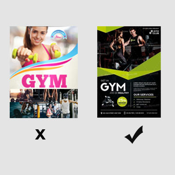
2- Too Many Stock Images
Visuals work better than text in any given case, but the images you use should align with the theme and messaging of your design. Stock images are an affordable way to quickly add relevant images to your design. But using too many or too popular stock images can make your design look boring.
Think about it -- How would you make your brand’s designs stand apart from the competition if you use similar stock images or worse, the same stock images as your competitors?
Instead, you should look for stock images that are unique and well-fitting to your designs. You can also find stock illustrations online and modify them to match your brand colors. More importantly, you should avoid scaling images too much or you may end up pixelating them in your design. Also, purchase images correctly to avoid any copyright issues, and use high-quality vector images wherever possible.
3- Not Having Negative Space in Design
Negative space means having empty space or white space in your design, which basically gives the content some room to breathe. It allows your design elements to shine by themselves instead of having to compete with each other for the viewers’ attention. It also helps highlight the more important pieces of information in your design.
Cramming too much information into limited space can make it difficult for your design elements to stand apart and in turn confuse viewers. That is why, you should space and size your elements correctly, and leave out some negative space.
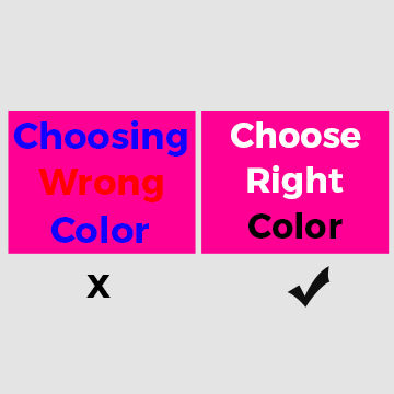
4- Wrong Choice of Colors or Too Many Colors
Colors can make all the difference to your design. The right colors can bring out your design elements and make your users want to interact with your design. Whereas, the wrong colors can make people run away from your design, quite literally.
For instance, it is usually best to avoid fonts that are too light or difficult to read.
Similarly, you should also avoid using a whole rainbow full of colours in your design because it can hurt the eyes of the viewers. Instead, you should only be using two or three colours at the most. Moreover, the colours that you use should complement each other. In most cases, it's best to use the same colours that you use for branding in your designs as well so
Medium, for example, uses only three main colours on its website -- black, white, and green. While the shade of green is a bit bright, it perfectly goes with the muted black and white.
5- Lack of Visual Hierarchy
You need to maintain a visual hierarchy between all the design elements on your page. The most important information should be the most prominent part of your design to make sure viewers receive it immediately followed by the lesser important details. The information which does not contribute directly to the design or to the message can be taken out entirely.
You can use different font styles and sizes to establish hierarchy. It's also a great idea to use contrasting typography in order to visually divide the different levels of hierarchy in your design.
6- Failure to Think Cross-Platform
While creating any design, you should always keep user experience in mind: think about how viewers’ will perceive your design and interact with it. If you are creating a design for your company’s website, make sure that it looks great on both web and mobile. Your design may fit perfectly on mobile, but if it distorts on your desktop browsers, it can quickly turn off prospective customers.
7- Over Designing
Much like over-engineering, over designing is another thing that takes away from the credibility of any given project. Just because you can add another element does not mean you should. Designers understand that and think from a user’s perspective. Every element that you add to your design should provide value to the end-user. There is nothing more attractive than a simple design that embraces minimalism and strips away unnecessary elements like too many colours, fonts, and heavy heavy illustrations.
Design Thoughtfully
Keeping these design principles in mind, you can design compelling and attention-grabbing content. And if it seems a little too much, never fret seeking advice from a professional!
Prrowess offers unlimited graphic design services for all your designing needs. We have dedicated and experienced graphic designers who work closely with you to understand your design requirements and create designs that perfectly align with your needs.
.png)


Comments